Intention Architect Marek Jan Štěpán has occupied himself with the idea of this church intermittently for the past 30 years. However, the intention to build a church first came up in the relaxed atmosphere of 1968 and was finally fulfilled after 50 years. Its location was chosen by the architects of the wonderful housing estate, František Zounek and Viktor Rudiš. The church is fully funded by the church offerings and donations. It is the first church to be dedicated to Bl. Marie Restituta who was born approximately 600 meters from its location.
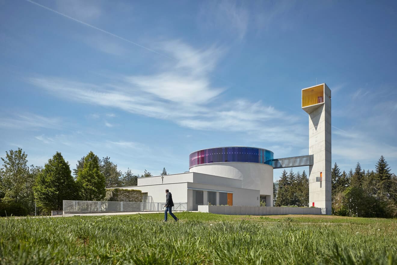
Photo: BoysPlayNice. (click on the image to view the photo gallery)
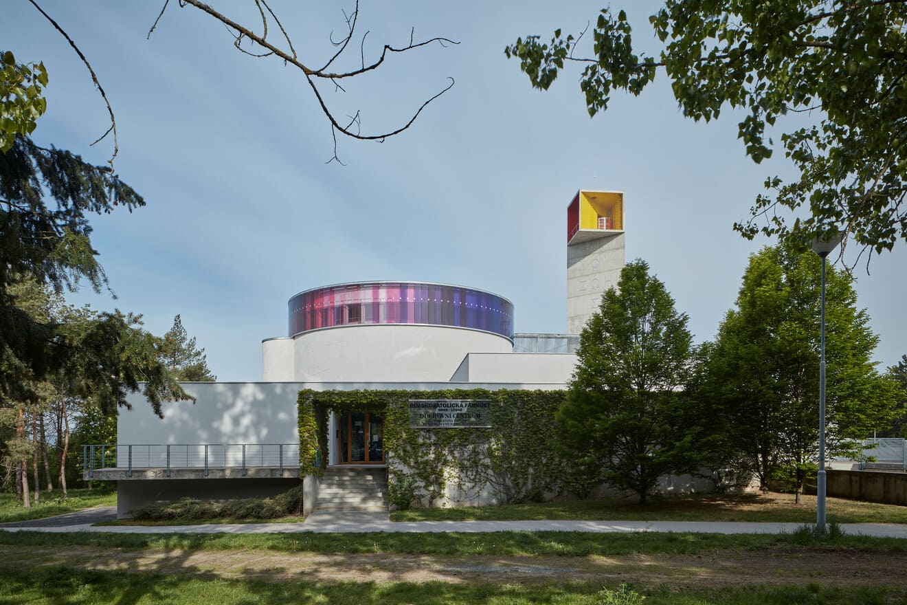
Urbanism The church is located in the heart of the housing estate at the mouth of the Čertova rokle ravine. The area is covered with tall concrete apartment buildings. The new church cannot compete with them in terms of size, which is why it has been designed to be very simple in expression, elementary in geometry and therefore easily legible.
A rectangular plateau is laid out on the plot that defines the sacred district. There are three basic masses on it – the church, the tower and the spiritual centre (designed by Zdeněk Bureš). The original centre is rectangular, the tower is triangular and the church is circular, which means the three basic geometric shapes are all represented. The sacred district is built in a completely different scale which differentiates it from the surrounding blocks of flats and creates a dominant on a wholly new level.

Photo: BoysPlayNice. (click on the image to view the photo gallery)

The Circle The church has a circular floor plan. The circle is an age-long symbol of heaven and eternity (in contrast to the square, which refers to earth and transience). The heaven is reflected back in the colourful annular window that embraces the church just below the roof. It might be said that the circle is floating above Lesná or, on a figurative, transcendental level, that the heaven is floating above Lesná. There are several reasons why we chose circular shape for the church. The circle is the shape of fullness, it is the full stop in the area of the housing estate and its spiritual focal point that should serve as a place where people can break out of the daily hustle, rest for a while or recollect themselves. The circle is also very close to the contemporary perception of liturgy in church that represents the community of the Apostles and Jesus around the table during the Last Supper. The tabernacle is located in a tall apse illuminated from above that is situated on the left side of the church. The church wall is torn by a triangular opening at this point, which serves as a reference to the tear in the Jerusalem temple curtain.
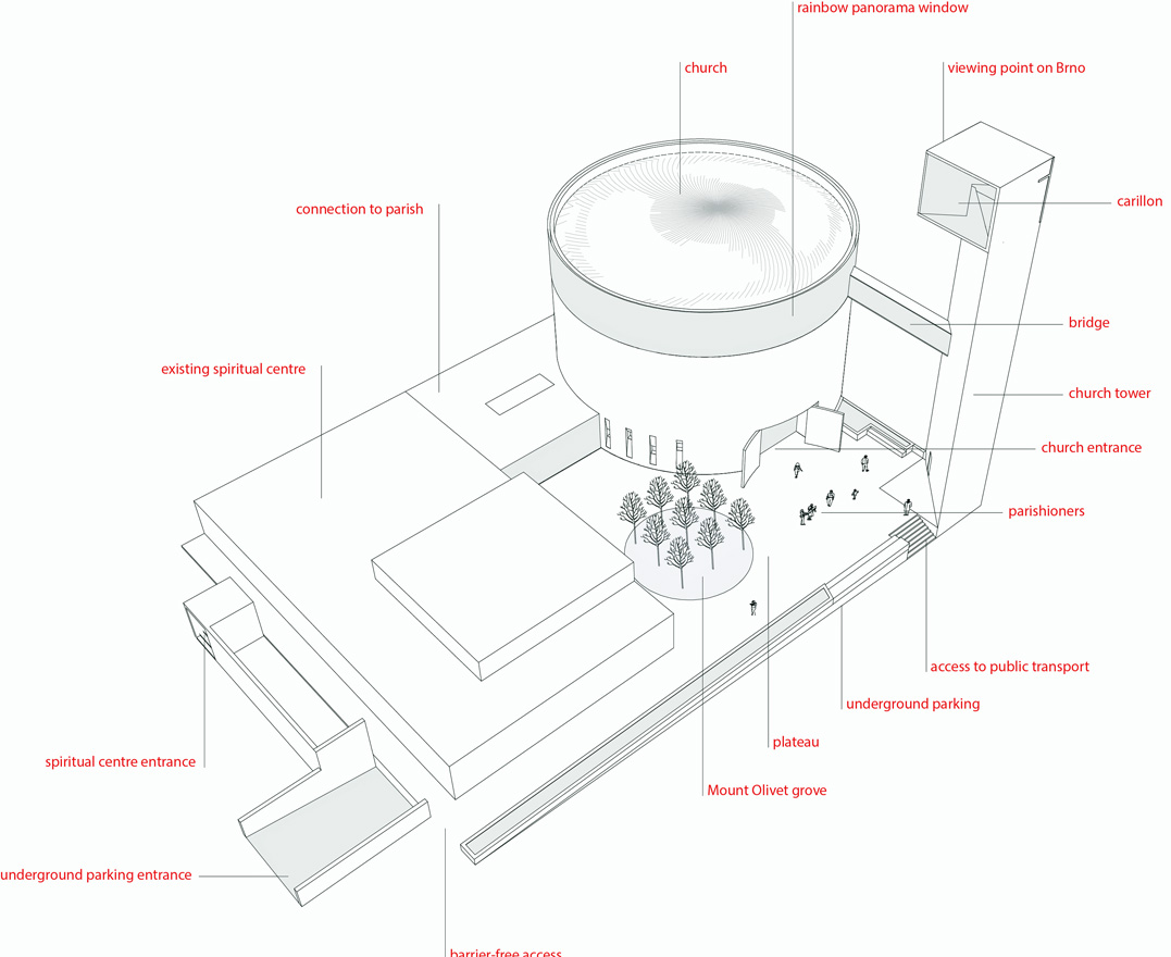
Axonometry of area. (click on the image to view the photo gallery)
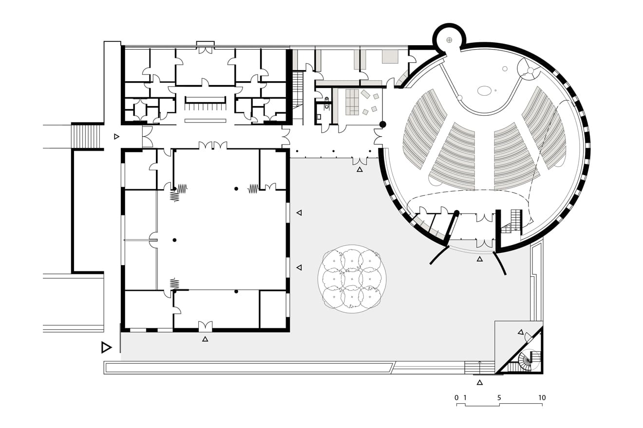


God’s Touch The asymmetric dome is cast into a matrix made of wooden planks that resembles a fingerprint so huge that it looks like the fingerprint of God (God’s Touch). Thus, if you want, you can experience God’s touch here (not just thanks to the dome, of course).

Photo: BoysPlayNice. (click on the image to view the photo gallery)

The Interior and the Rainbow The interior of the church forms an inner universe. It is an organ for communication with God. It is simple, composed, and collected. The visitor should feel safe, balanced, and undisturbed by the outside world, almost like in the mother’s womb. The soft and sleek lines of the structure form a disembodied inner space shaped by the light coming from the annular window above. Its purpose is to give indirect, soft daylight that does not cast hard shadows. The symbol of the covenant between God and His people – the rainbow – is depicted on this 80-meter-long window. A circular rainbow is a phenomenon that can actually be observed from high altitudes, often from planes. The light is turned into an element that hints on something beyond the limits of material reality, something barely perceivable with our senses.

Photo: BoysPlayNice. (click on the image to view the photo gallery)
The Tower The tower stands further from the church. Its triangular floor plan ensures that it looks different from the inside of the church than it looks from the outside. From the outside it serves as a fixed point, a static kubus that refers to the westworks of the old churches and that anchors the whole compound on a small promontory. The side facing the church is open with a square lantern and there is a yellow part with a glockenspiel and a red part with a lookout on the Brno city centre.
The tower is both a vertical and a horizontal. Unlike the historic towers that point only to heaven like a rocket, here the direction is diverted and points to the church, which represents the vertical of the relationship of God and His people. Being 31 meters high, it is a local dominant even though it is not higher than the surrounding blocks of flats. A steel spiral staircase goes through the concrete tower, which, when looking above, reminds one of the colour scheme and the shape of the church dome. The sign FOS ZOE (meaning light and life) in the shape of the cross is inscribed on the tower. The same sign was found in archaeological digs in Mikulčice dating back to Velká Morava period.

Photo: BoysPlayNice. (click on the image to view the photo gallery)

Materiality The material of the building follows up on the material mostly used in the surrounding housing estate, which is concrete. It is built on pilots as one dilatation unit. Prestressed reinforced concrete is used for the most strained parts – wreaths and chancels, chancels are covered by moniers constructions. The concrete materials are complemented by distinctive colourful elements. The church is designed as environmentally friendly, as the parishioners requested. Heating is provided by a ground source heat pump.
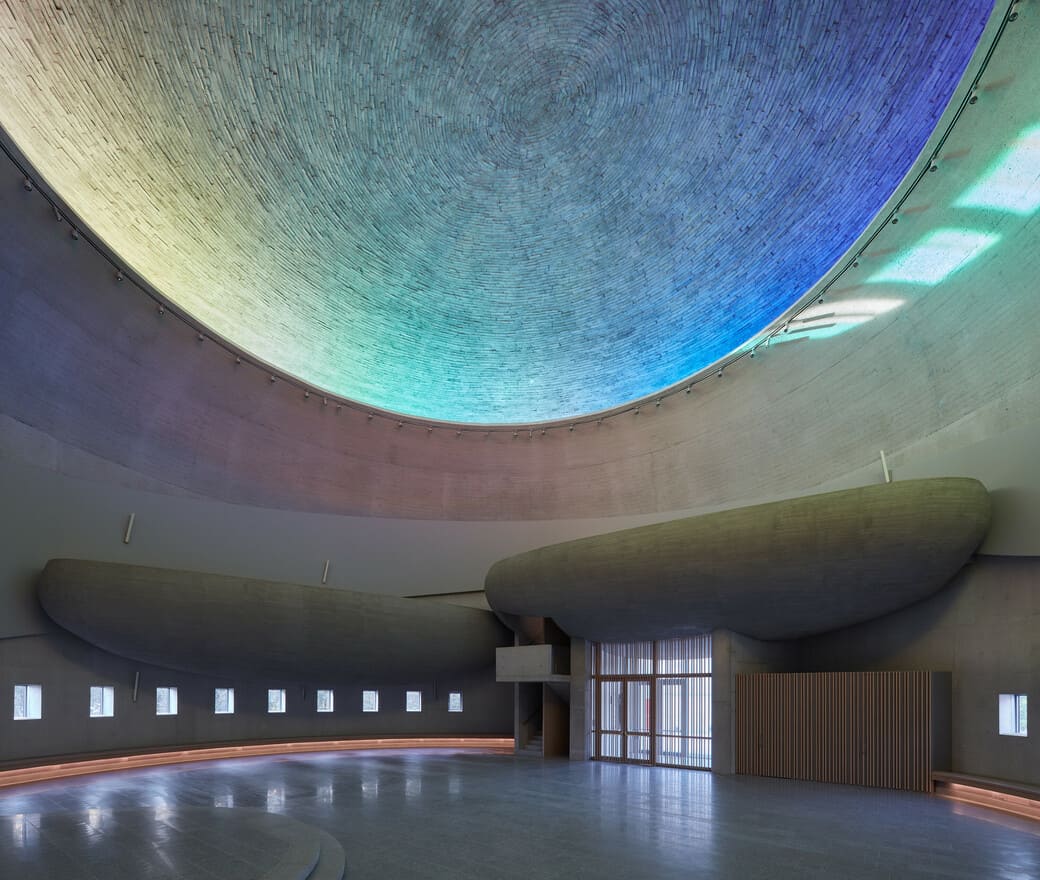
Photo: BoysPlayNice. (click on the image to view the photo gallery)

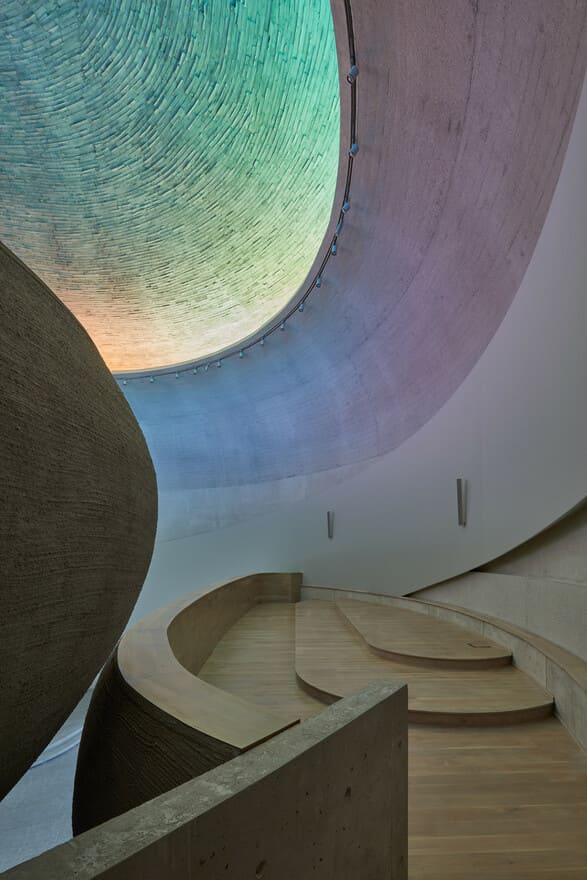
The Concrete The most beautiful quality of concrete is that it is truthful; it reflects the effort and energy put into the formwork, into the pouring and compacting of the concrete, into the processing of the additives and the mixture. All that will have an impact on the surface, in its vivacity, as a reflection of life. A parallel can be found in the historic stone masonry made of individual blocks of different hues and cementing the joints. With concrete, there are the imprints of the shuttering interstices, distinct surfaces imprinted by the shuttering and slightly different concrete in every pouring, which means that poured concrete visually follows up on the stone masonry. The austerity of concrete also refers to the contemporary perception of the sacral space, which should not be visually or semantically overloaded. There is an interesting fact regarding the precise details and the finishing of the surfaces. Muhammad Lasfer from Algeria was in charge of the surfaces and I think that as a Moslem originally from the Middle East he has a close affinity to abstraction that is desired when working with concrete surfaces.

Photo: BoysPlayNice. (click on the image to view the photo gallery)


