When wood shapes Paris
A simple but essential question guides the conception of Tolbiac: what is housing? Housing should elevate the individual to the rank of inhabitant of the world, install a home and in the city, connect to yesterday and tomorrow, let us contemplate the near and distant elsewhere, structure our views, let us touch the mineral and the woody, the light and the dark, be caressing and rough, clear and blurred, welcoming like a hotel and simple like a shelter, make us big and small at the same time.

Photo: Luc Boegly.

A good housing building would know how to calm the metropolitan agitation without extinguishing it, how to make a private salon and a public place, how to be both a hut and a palace, how to cultivate the good life and let the weeds grow, how to watch over the sleep of the inhabitant and make the passer-by dream. Without ignoring the functional dimensions of architecture, the Tolbiac project attempts to take housing towards the multiple forms of living, by exploring the expressiveness of materials, the potential of common spaces, the openings of the landscape and the arrangement of typologies, the relationship to the place and its history.
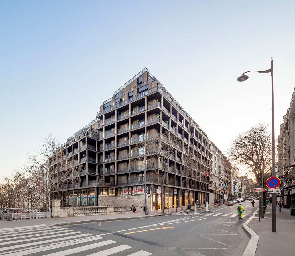
Photo: Luc Boegly.


For a long time, the intersection of the Tolbiac street and the Chevaleret street announced a change of landscape in the Parisian space, the passage from a dense suburb to a universe of railroads, an industrial river spanned by a metal bridge. The development of the Seine Rive Gauche district has erased the work of art and buried the railway plain under an artificial ground, at the risk of falling into a generic form of city that hardly expresses the specificities of the place. At the crossroads of the old city and the city in formation, the Etoffes de Tolbiac project wants to be part of its site without Edealizing the past, to evoke a particular Parisian history in order to give back a specific identity to a housing operation of its time, open to the city while filtering its most invasive nuisances and stimuli.
Plan etage courant R+1.

Urban façade The site occupies a doubly strategic position, at the corner of two streets separated by a difference in level of nearly seven meters. The staircase historically linking the two streets borders the site of the operation, formed by the joining of two parcels. Craft workshops and warehouses built from the 1920s to the 1960s are replaced by a mixed operation with 3.000 m² of commercial space and 5.000 m² of housing.

Photo: Luc Boegly.

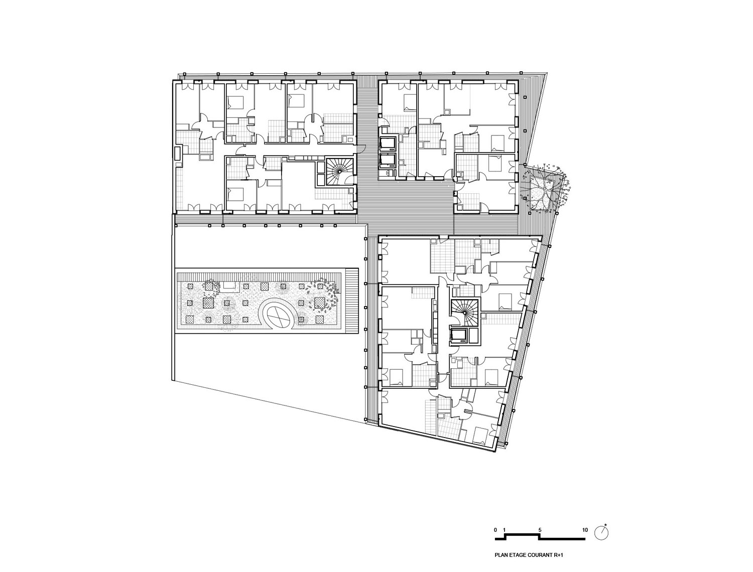
The distribution of the commercial surfaces between the first floors of the two streets minimizes the impact of the activity, which gives a base to the housing that spreads out from the first floor on the rue du Chevaleret. The 88 apartments are divided between four blocks, three of which are joined by common spaces and an independent block on the ground floor. The grid of balconies unifies the three parts of the project rising to first floor + 6 and first floor + 8. It reconstitutes the continuous fabric of the Parisian street.
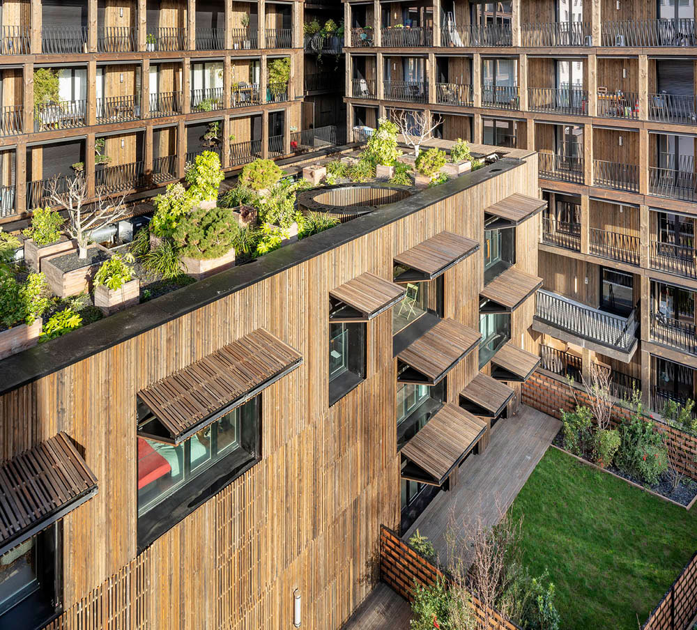
Photo: Luc Boegly.

A mixed wood and concrete project The duality of wood and concrete guides the design of the project. The mechanical qualities of concrete, its resistance to fire and its acoustic attenuation capabilities led to its use in the structure. Larch wood is used as cladding on all surfaces, while the structures of the woodframe walls and the vertical uprights of the facade are made of Douglas fir. The visible wood elements acquire a dark color by autoclave treatment, evoking the facades of the old warehouses of industrial Paris.
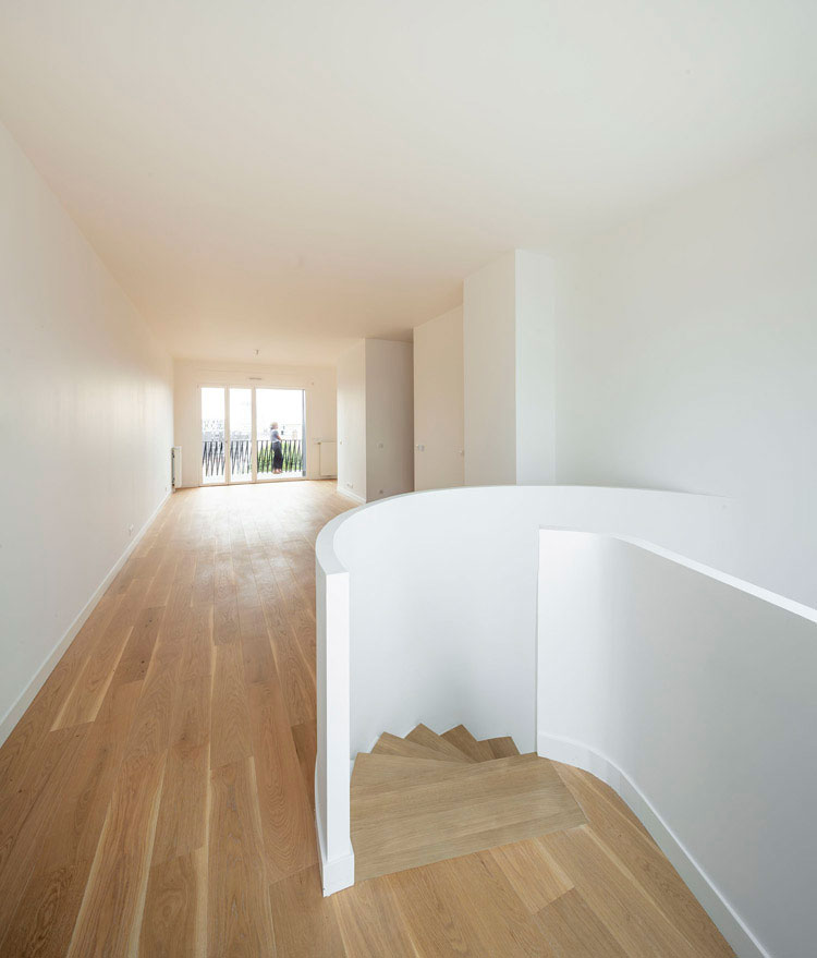
Photo: Luc Boegly.
The tactile qualities of the material as well as its visual qualities are highlighted. Solid wood was preferred to glued laminated wood for the posts of the facade, with the intention of enhancing the qualities of the material, developing an architectural aspect reminiscent of the natural origin of this element, breaking with the products reconstituted by gluing usually used in wood construction. Glued laminated elements are used very occasionally for the creation of curved beams carrying common spaces. Metal is used for the railings, with a gunmetal finish that integrates it into the whole.

Photo: Luc Boegly.


Shift and gaps The distinction between architecture and construction is often seen in the details. A subtle play regulates the placement of the vertical posts of the balconies. They do not follow a regular pattern, as one might think at first glance, but are offset laterally and vertically by ten centimeters at each level, gradually corbelling onto the street space. The device animates the façade and increases the surface of the balconies with the increase of the floors. This grid that unites the different blocks on the street side absorbs the voids left between each block. On the courtyard side, the interstices become common spaces, both terraces and plazas, with hoppers visually linking the different levels and the addition of extraordinary elements, such as “nests”, hanging lounges shared by the residents.

Photo: Luc Boegly.
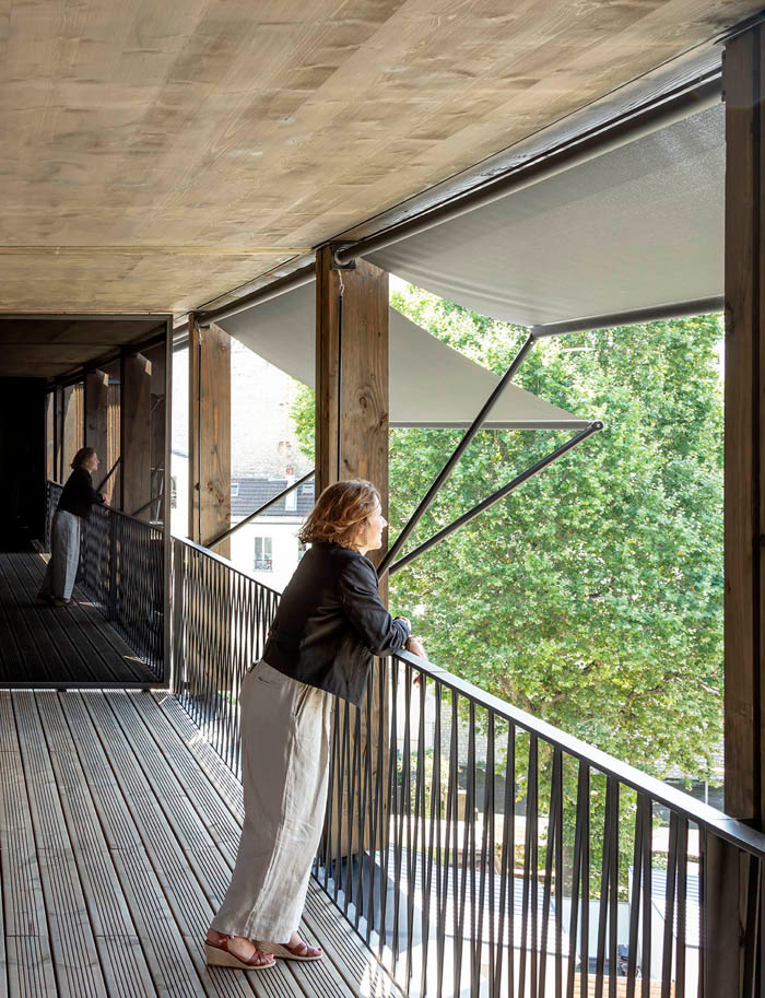
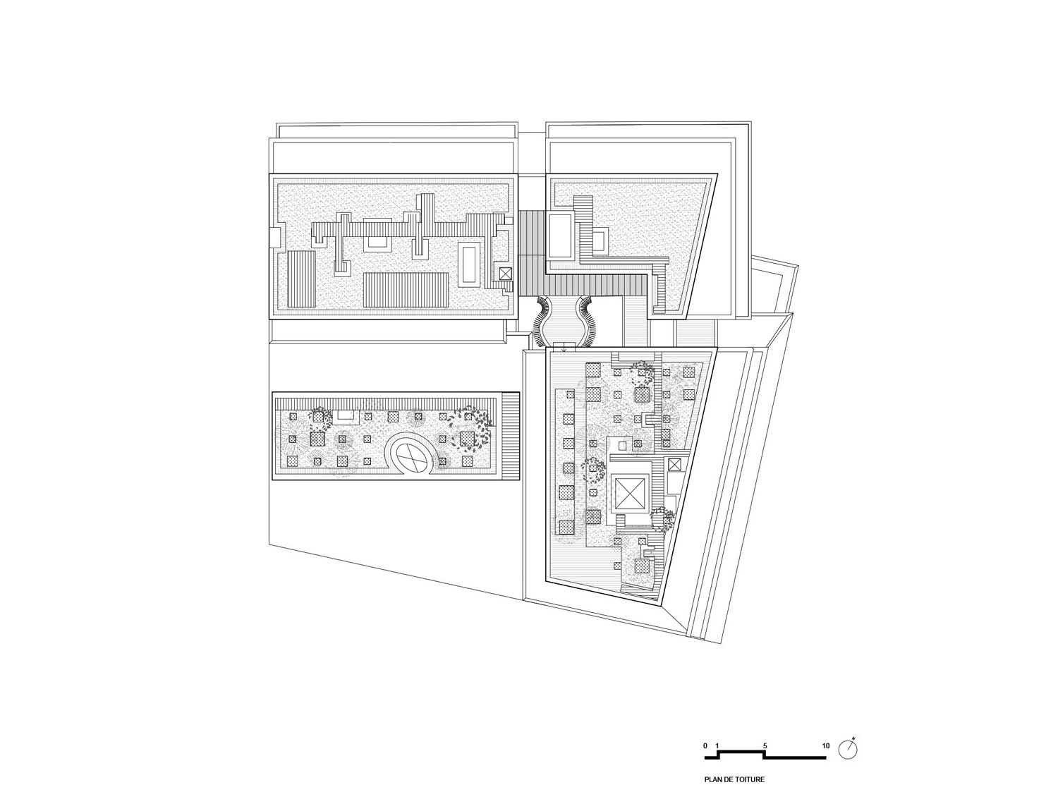
The maze of circulation revisits the joyful disorder and surprises of the backyards of the industrial suburbs of Paris. Two years of pandemics help to measure the value of these spaces open to all residents, offering an alternative to home, and allowing all residents to enjoy the views of the city. The roof garden open to all opens at 240° on a panorama piling up several decades of the evolution of Paris, and on the sky.

Photo: Luc Boegly.


