En 2005, el Ayuntamiento de Berlín convocó un concurso para definir la volumetría y las ordenanzas de una manzana definida por la Schinkelplatz, la Straße an der Kommandantur, la Niederlagstraße y la plazuela configurada por dos proyectos de Schinkel, la Friedrichswerdersche Kirche y la Bauakademie, y el Ministerio de Asuntos Exteriores. Resultó vencedor de tal concurso el arquitecto Theo Brenner y de acuerdo con su proyecto se adjudicó el desarrollo de la citada manzana a la compañía Frankonia, con el compromiso de convocar otros concursos de arquitectura, más tarde, para llevar a cabo los distintos edificios que la componían, entendiendo que en tales concursos el Ayuntamiento debería jugar un predominante papel.
El proyecto que aquí se presenta resultó vencedor en el convocado en el año 2013 para los edificios que hacían acto de presencia en el ámbito comprendido entre la Friedrichswerdersche Kirche, la Bauakademie y el Ministerio de Asuntos Exteriores.

Foto: ©Duccio Malagamba.
La memoria que acompañó al proyecto presentado al concurso es la que sigue:
“Que incluso cuando todo parece determinado hay lugar para una intervención arquitectónica amplia, en la que cabe dar entrada a una discusión teórica de alcance, es algo que, como nosotros, habrán tenido ocasión de comprobar los colegas arquitectos que han acudido a este concurso. Pues una lectura apresurada de aquello que se demandaba en él llevaría a pensar que se trataba de ofrecer una respuesta a cómo materializar el volumen proyectado por Theo Brenner o, dicho de otro modo, cómo dibujar unas fachadas para el mismo. Pero tan pronto como el arquitecto se adentra en el problema, éste aparece con una nueva dimensión. ¿Cuánto, tan solo desde unas alineaciones, se puede generar un edificio? ¿Qué carácter, o si se quiere, qué aspecto debe tener un edificio situado entre dos obras de tan marcada identidad como la Friedrichswerdersche Kirche y la Bauakademie? ¿De qué modo conciliar o mediar, si se prefiere, entre edificios tan diversos, a pesar de venir de manos de un mismo arquitecto, como la Friedrichswerdersche Kirche y la Bauakademie?
Inevitable para un arquitecto curioso el acudir a los dibujos de Schinkel y en efecto su examen nos lleva a ver que, entre la planta de situación que él dibujaba en 1831 y aquella en la que se nos pide operar ahora apenas hay diferencias, si bien cupiera señalar matices tan importantes como los paralelismos introducidos en los trazados y la pérdida de la condición oblicua que la fachada tenía sobre la plaza. Schinkel da algunas pistas sobre cómo actuar ya que el dibujo mencionado distingue claramente entre lo público y lo privado y la sutileza con la que se ha dibujado el perímetro nos lleva a pensar que hay que estar atentos, al trabajar en él, a sus quiebros e inflexiones. Por otra parte, en un dibujo de 1828, y más tarde en otro de 1834, Schinkel nos advierte de cuánto la iglesia, en primer lugar, y la Bauakademie convivían con la arquitectura doméstica de los edificios vecinos, dando muestra de admirable indiferencia estilística.
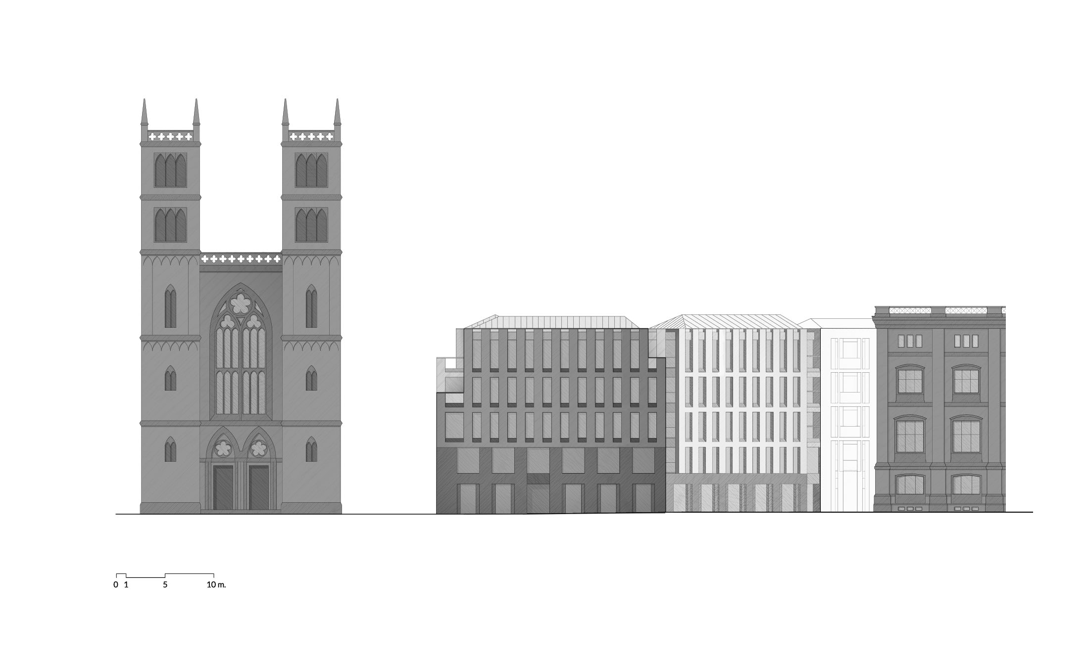
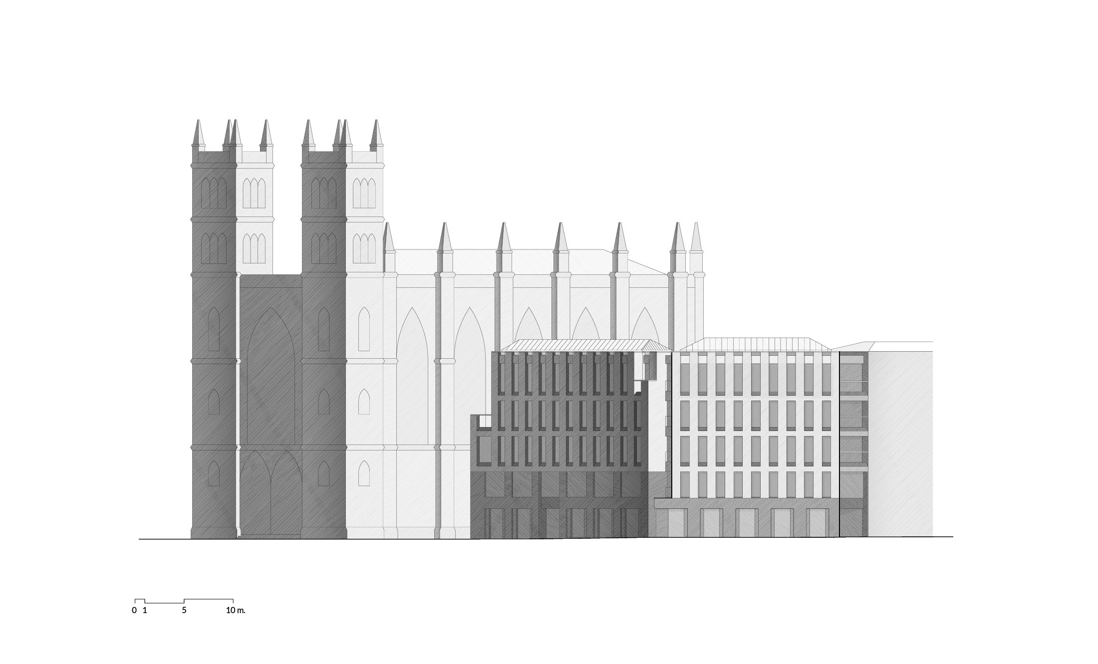
Pero que hoy, y sin entrar en la discusión de las preessistenze ambientali, la Friedrichswerdersche Kirche y la Bauakademie exigen un respeto al que no puede ser ajeno el arquitecto que actúe en tan destacado lugar, es un ineludible punto de partida. Y que tal respeto, además, está ya presente en la volumetría sobre la que se nos pide operar, es algo obvio. La propia fragmentación del área del concurso así lo manifiesta, al entender está asociada a una arquitectura doméstica y por ello bien diversa de aquella condición monumental de la arquitectura schinkeliana. Subrayar esta condición fragmentada está presente en nuestro proyecto que propone, como claramente muestran los dibujos y la maqueta, una descomposición del volumen en dos segmentos: uno que se orienta hacia la Bauakademie, a la que nos gustaría rendir tributo de pleitesía desde su planitud, y otro que mira hacia la plaza, reconociendo que tiene una mayor jerarquía, algo que se traduce en la importancia del zócalo. Los dos puntos de vista elegidos para representar el volumen describen con elocuencia lo que aquí se apunta. Y en tanto desde la vista 2 toman mayor relieve las torres de la iglesia y la plaza, desde la vista 1 se tendría una visión sesgada del nuevo edificio que serviría de marco para la Bauakademie, percibiéndose a lo lejos en el horizonte, como fondo de perspectiva de la Schinkelplatz la cúpula de la catedral. Por otra parte, desde este último punto de vista se enfatiza el modo en que el nuevo edificio se produce sobre Niederlagstraße: la erosión de la esquina contribuye eficazmente a reducir el volumen manteniéndose así el protagonismo que la Friedrichswerdersche Kirche tiene.
Esta deseada fragmentación del volumen que, como dijimos, enfatiza el carácter de arquitectura doméstica que se pretende que el proyecto tenga, implica resolver adecuadamente el encuentro y la transición con los edificios correspondientes al sector 2 del concurso. Quien estudie el proyecto observará que se ha hecho uso de las inflexiones para definir con más libertad la obligada articulación al introducir ‘intervalos verticales’ que permitirán un más fácil ajuste con los edificios vecinos. La fragmentación que está en el origen de esta propuesta aparece también en la cubierta: la ruptura de la continuidad de la misma lo manifiesta como bien muestran tanto la maqueta como la planta de situación. Pero que se trata de una sola intervención, que no se quisiera caer en una fingida diversidad y sí demostrar cuánto se busca una solución integral a todo el frente del bloque/manzana, se manifiesta en el remate, en la logia con la que se coronan los volúmenes, elemento que da continuidad visual al conjunto y que se convierte en leitmotiv formal de la propuesta. Y algo no muy diverso habría que decir para los zócalos, que mantienen la doble altura en el encuentro con las casas medianeras pero que luego se reducen tanto en Niederlagstraße como en la Schinkelplatz adquiriendo mayor relieve en la plaza.
Este reconocimiento de la virtud implícita en las inflexiones para fragmentar el volumen originario da también pie a dividir la superficie construida, algo que asociamos con la disposición de los núcleos de comunicación vertical. Accesos a las viviendas desde Niederlagstraße, desde el Werderscher Markt, desde la Schinkelplatz que luego se conectan desde el espacio ajardinado interior, garantizan la independencia demandada en las bases. Digamos ahora que los núcleos de comunicación vertical se han proyectado buscando la mayor eficiencia y teniendo muy presente la obligada sección que ha llevado a que las dos últimas plantas se hayan resuelto con una solución de vivienda dúplex. La doble orientación de las viviendas y el respeto a la ortogonalidad sugerida por las alineaciones de las fachadas, se refleja en la elección tipológica y, como bien puede advertirse en los dibujos, el diseño de las fachadas permite tanto la flexibilidad de la distribución de las viviendas como el dotar a la arquitectura de la discreción y dignidad que garantiza el tipo de huecos adoptado. En la presente propuesta se contemplan: una planta comercial; 6 viviendas (susceptibles de ser transformadas en oficinas) en la planta primera; 6 viviendas en la planta segunda; 6 viviendas dúplex en las plantas tercera y cuarta. En cuanto a los aparcamientos, hemos procedido a situar el acceso en la Niederlagstraße tal y como se pedía en las bases y se ha rebajado la cota del sótano un metro para construir los dos sótanos que necesitábamos a efectos de alcanzar todas las plazas de aparcamiento que se demandaban en nuestro solar, 20 plazas. Y todo ello sin que sea óbice establecer un aparcamiento compartido con el solar 2.
En el proyecto se hace uso de los materiales propuestos – estucos de distintos colores – que contribuirán a que los nuevos edificios se integren en la fábrica urbana adecuadamente. Los cuadros anejos establecen cuáles son los colores elegidos dentro de la gama que se nos ofrece. En principio los tonos más claros se utilizan en las cotas altas de los paramentos, que en nuestra propuesta aparecen coronados por un remate, o bien de hormigón o bien de piedra natural, con el que se da continuidad a la ‘loggia’. La elección del estuco se extendería a los espacios interiores y, en los zócalos, en las guarniciones verticales y en las pilastras se haría uso de un tono más oscuro, como bien muestran los dibujos. El arquitecto es consciente de la importancia que en un proyecto como éste tienen los huecos. Practicados de suelo a techo, y resueltos con carpinterías de madera pintadas en tonos claros – más claros todavía que el estuco, próximos al blanco marfil – el oscurecimiento se produciría con una persiana enrollable tal como muestra la sección. Interior y exterior deberían, como ya quedó dicho, moverse al unísono, pero los huecos ahora no insisten tanto en lo genérico cuanto en lo singular. Nos gustaría que el patio interior, en el que al ajardinamiento y a los pavimentos habría que dedicar tanta atención, se percibiese como un espacio no tan formal y un tanto fortuito.
Creemos que el proyecto ha quedado bien definido para poder entender lo que han sido nuestras intenciones. Tan sólo una observación: hemos optado por representar los renders de la manera más neutra y objetiva, sin pretender alcanzar imágenes de un realismo siempre equívoco, buscando que en ellos quedase clara cuál sería la relación volumétrica de nuestra propuesta con edificios tan característicos como la Friedrichswerdersche Kirche y la Bauakademie”.

Situación planimétrica.
Hasta aquí, la memoria del concurso. Como adenda, me gustaría hacer constar la importancia de los materiales. La inmediata construcción obligó a una definición más precisa de los mismos. Entendiendo que el zócalo debía presentarse con más contundencia de aquella que proporciona un estuco, la elección de un material que no contrastase con la escena arquitectónica establecida por la Friedrichswerdersche Kirche y la Bauakademie nos llevó a apostar por una piedra que siempre nos había atraído: la de Espejón en Soria. Una ‘brecha’ que había utilizado Villanueva en la Capilla Palafox de la Catedral de El Burgo de Osma, ya que nos parecía que en ella coincidían el deseo de abstracción que animaba a los arquitectos de la Ilustración y la rica coloración del ladrillo usado por Schinkel en la Friedrichswerdersche Kirche. La piedra de Espejón, por tanto, en el zócalo y en las jambas de las ventanas, y un enfoscado terroso son los materiales con que se ha configurado la tersa geometría de la fachada.

Foto: ©Duccio Malagamba.
Cambios en el programa llevaron a modificar las plantas, como bien puede comprobar quien las examine. Los tres pequeños edificios de viviendas se convirtieron en dos. El edificio próximo a Friedrichswerdersche Kirche iba a estar destinado a oficinas en tanto que el más próximo al canal y a la Bauakademie comparte uno de los núcleos verticales con el edificio de viviendas de Schultes para alcanzar los estándares de superficies que se juzgaban más adecuados a la centralidad del solar.
El edificio de oficinas lo adquirió Bertelsmann, que ha instalado en la planta baja un centro audiovisual en el que se da cuenta de las actividades de una empresa de comunicación de proyección universal de la que los alemanes se sienten orgullosos. Y si bien la proyección mundial de la empresa justifica la localización, dada su proximidad al Ministerio de Asuntos Exteriores, en mi opinión, un espacio tan bien situado hubiera merecido un uso público más abierto, haciendo el edificio más accesible a los berlineses.
Rafael Moneo

Planta Baja.

Office and residential building at Schinkelplatz, Berlin
In 2005, the Berlin city council called a competition to define the massing and the set the guidelines for a block bordered by Schinkelplatz, Straße an der Kommandantur, Niederlagstraße, and the small square shaped by two Schinkel projects: on one hand the church Friedrichswerdersche Kirche and the Bauakademie, and on the other the Ministry of Foreign Affairs. The competition was won by the architect Theo Brenner, and in accordance with his scheme, the development of the block in question was assigned to the firm Frankonia, with a commitment to later call more architecture competitions for the various buildings that would comprise it, and on the understanding that Berlin City Hall would play a predominant role in these further competitions.
The project presented here was the winner in the 2013 competition for the buildings which were to rise within the area bounded by Friedrichswerdersche Kirche, the Bauakademie, and the Ministry of Foreign Affairs.
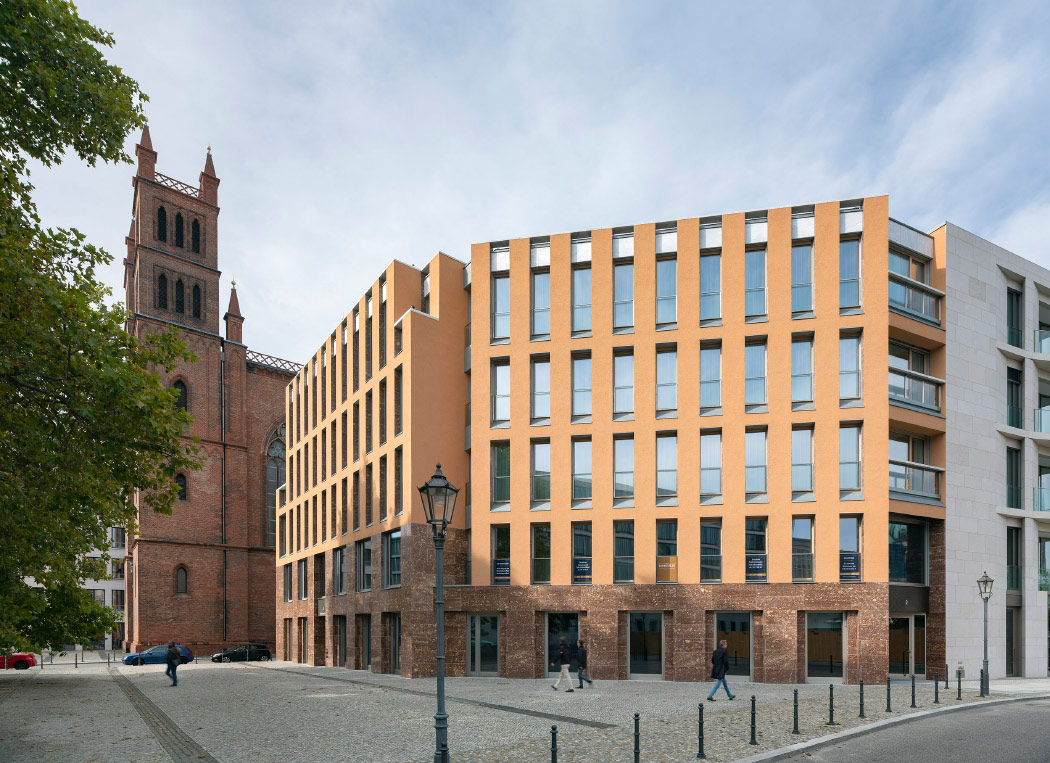
Foto: ©Duccio Malagamba.
The following is the text that accompanied the scheme submitted for competition:
“That even when everything seems predetermined there is ample room for an architectural intervention – of the kind that in turn welcomes a wide-reaching theoretical discussion – is something our fellow-architects participating in this competition surely know from experience, as we do. I say this because a quick perusal of what was being required of us here might have made us think we were being asked for an answer to the question of how to materialize the volume marked by Theo Brenner, or, in other words, how to draw facades for it. But as soon as the architect delves into the problem, the matter takes on a new dimension. Exactly how much of a building can be generated from just a few alignments here and there? What kind of character – or appearance, if you will – befits a building that is flanked by two works of such strong presence and identity as Friedrichswerdersche Kirche and the Bauakademie? How is one to reconcile – or perhaps mediate between, as it were – two buildings which, though coming from one same architect, are in fact so unalike?
A curious architect will inevitably go to Karl Frierich Schinkel’s drawings, and examining these showed us that there are hardly any differences between the site plan he drew back in 1831 and the one we are now being asked to work upon. However there are nuances to point out, important ones like the parallelisms introduced into the schemes and the elimination of the facade’s oblique form over the square. Schinkel gives some clues on how to proceed, as the drawing makes a clear distinction between public and private and the subtlety with which he traced the perimeter tells us that when working within it, we have got to keep alert to any ruptures and inflections. On the other hand, in his drawing of 1828 – as well as in one of 1834 – Schinkel points out how the church and the Bauakademie engaged with the domestic architecture of the neighboring buildings, a remarkable, admirable case of indifference to stylistic differentiation.
Today, however, and without entering into a discussion on preessistenze ambientali, Friedrichswerdersche Kirche and the Bauakademie call for a respect that no architect working in such a prominent place can be oblivious to, and which is therefore an unavoidable starting point. And it is obvious that this respect is in fact already present in the massing we are tasked to work upon. The actual fragmentation of the area covered by the competition says as much, associated as it is with an architecture that is domestic and thus diverging from the monumental nature of Schinkel’s buildings. Emphasis on this fragmentation is inherent in our project. The drawings and the model clearly show a decomposition of the volume into two segments: one facing the Bauakademie, which we wish to pay obeisance to in its planarity, and the other looking towards the square, recognizing its greater hierarchy, which translates into the importance of the plinth. The two points of view chosen to depict the volume eloquently shows what is being explained here. And while from angle 2 the church towers and the square take on more importance, from angle 1 one has an oblique view of the new building that would serve as a frame for the Bauakademie when it is seen from a distance on the horizon, just as the cathedral dome is a perspective background of Schinkelplatz. On the other hand, from the latter viewpoint there is emphasis on how the new building materializes over Niederlagstraße: the erosion of the corner efficiently helps to reduce the volume, ensuring that Friedrichswerdersche Kirche continues to take center stage on the site.
This desired fragmentation of the volume, which, as we said, emphasizes the domestic-architecture tone that we want for the project, requires an adequate resolution of the contact and transition with the buildings corresponding to sector 2 of the competition. One will observe that the inflections have been used to more freely define the obligatory connection, with ‘vertical intervals’ introduced to facilitate adjusting to the neighboring buildings. The fragmentation that lies at the heart of the scheme also appears at the roof: the disruption of its continuity is as evident in the model as it is in the site plan. This is, however, a single intervention which does not wish to fall prey to a feigned diversity, but does want to demonstrate the degree to which it has pursued an integral solution to the entire front of the city block, manifesting itself on the top, in the loggia crowning the volumes, an element which gives visual continuity to the complex and becomes a formal leitmotiv of the scheme. And something similar would have to be said about the plinths, which maintain a double height in the contact with the adjacent houses, but shrink on both Niederlagstraße and Schinkelplatz, taking on greater importance on the square.
This recognition of the merit implicit in the inflections made to fragment the original volume also leads to dividing up the built area, which is something we associate with the arrangement of vertical circulation cores. The accessways to the dwellings from Niederlagstraße, from Werderscher Markt, and from Schinkelplatz – which later connect with the interior garden space – provide the autonomy stipulated in the briefs. Let us now say that the vertical circulation cores have been designed to maximize efficiency, and bearing in mind the obligatory section that has led to executing the top two floors with a duplex solution. The double orientation of the apartments and the respect for the orthogonality suggested by the alignments of the facades are reflected in the choice of typology, and, as well shown in the drawings, the design of the facades allows flexibility in the layout of the units as much as it gives the architecture the discretion and dignity provided by the selected window type. The scheme provides: a commercial level; 6 apartments (which can be turned into offices) on the first floor; 6 apartments on the second floor; 6 duplex units on the third and fourth floors. As for parking, we have put the garage entrance on Niederlagstraße, as stipulated in the brief, and lowered the basement by a meter to make room for the two basement levels we need to provide all the parking spots required for our plot, a total of 20. And this without it becoming a hindrance if parking shared with plot 2 is established.
The project makes use of the materials proposed, stuccoes of different colors, which will help blend the new buildings into the urban fabric. In theory, lighter tones are used in the higher sections of wall, which in our scheme are crowned with a finish, either or concrete or natural stone, giving continuity to the ‘loggia.’ The choice of stucco extends to the interior spaces, and in the plinths, vertical fittings, and pilasters, a darker tone is used. The architect is aware of the importance of openings in a project of this kind. Reaching from floor to ceiling and executed with wooden frames painted in light tones – even lighter than the stucco, close to white marble – the darkening would be efected with a roll-up shutter, as the section shows. Again, interior and exterior must move in unison, but the windows now put less stress on the generic than on the singular. We would like the interior courtyard, where landscaping and the pavements will require much attention, to be perceived as less formal, less stiff, even slightly accidental.
We believe the project is defined well enough for our intentions to be understood. Just one observation: we have opted to represent the renderings more neutrally and objectively, without trying to come up with very realistic images of the kind which are always equivocal, the idea being to make very clear how our project would in massing terms relate with buildings as iconic as Friedrichswerdersche Kirche and the Bauakademie”.

Boceto.
So ends the text that accompanied the competition entry. By way of an addendum, I would like to point out the importance of the materials used. The fact that construction work was to commence immediately called for a greater degree of precision in the definition of the scheme. Understanding that the plinth had to present itself more forcefully than stucco would allow, but also that we should choose something that would not strike too much of a contrast with the architectural scenery established by Friedrichswerdersche Kirche and the Bauakademie, we opted for a material that we had always been drawn to: stone from Espejón, in the central Spanish province of Soria. A ‘breach’ that Juan de Villanueva had used in the Palafox Chapel of the Cathedral of El Burgo de Osma, since it seemed to us that there, the abstraction desired by the architects of the Enlightenment coincided with the rich colors used by Schinkel in Friedrichswerdersche Kirche. Hence, Espejón stone – in the plinth and window jambs – and an earthy plaster are the materials that give form to the terse geometry of the facade.

Foto: ©Duccio Malagamba.
Changes made in the program eventually led to modifications in the floor plans, as anyone who sets out to examine these documents can verify. The three small apartment buildings became just two. The building close to Friedrichswerdersche Kirche was originally intended to house office spaces, while the one near the canal and the Bauakademie shares one of its vertical cores with Schultes’s apartment building in order to comply with the codes that were deemed most suited to the plot’s centrality.
The office building was acquired by the company Bertelsmann SE & Co., which has installed an audiovisual center on the ground floor that will showcase the activities of its multinational media conglomerate. Although the firm’s world importance justifies its privileged location, close, moreover, to the Germany’s Ministry of Foreign Affairs, in my opinion a space so well situated should have been more generously fitted out and opened for public use, making the building more accessible to the people of Berlin.
Rafael Moneo

Sección Constructiva. Leyenda: 1. Carpintería de aluminio con rotura de puente térmico y acabado bronce. Acristalamiento triple con vidrio de protección; 2. Zócalo de piedra ‘Rojo Espejón’ e = 80 mm, con superficies y cantos pulidos; 3. Alféizar de chapa de zinc; 4. Revoco e = 5 mm, coloreado en masa y acabado granulado en sistema de aislamiento térmico exterior; 5. Jambas de piedra ‘Rojo Espejón’ e = 40 mm, con superficies y cantos pulidos; 6. Carpintería de madera de roble con triple acristalamiento; 7. Persiana graduable con lama estanca anclada a panel de madera perimetral a carpintería; 8. Peto formado por vidrio armado de seguridad recogido por marco de aluminio con fijación lateral; 9. Albardilla de mármol ‘Blanco Macael’, espesores de 40, 80 o 120 mm según posición, con superficies y cantos pulidos; 10. Pasamanos de acero inoxidable Ø = 40 mm, acabado satinado, soldado a tubos de fijación Ø = 15 mm; 11. Dintel de mármol ‘Blanco Macael’ e = 60 mm, con superficies y cantos pulidos; 12. Pavimento exterior de granito gris e = 30 mm.


